During the redesign of the MONIQUE PÉAN website, the goal was to transform the user experience into something akin to an online brand ambassador, resembling an art gallery more than a conventional e-commerce platform due to the bespoke one-of-a-kind nature of the designs.
The central objective shifted towards the artful presentation of the jewelry, emphasizing the brand’s core principles of materials, travel, art, and architecture. This approach encouraged personalized client engagement while inviting users to immerse themselves in the materials and inspirational content through the use of diptychs and rich, tagged links.
—
Website design & photography
Studio: MONIQUE PÉAN FINE JEWELRY
Creative Director: Monique Péan
Digital Agency: PSA Creative
www.MONIQUEPÉAN.com
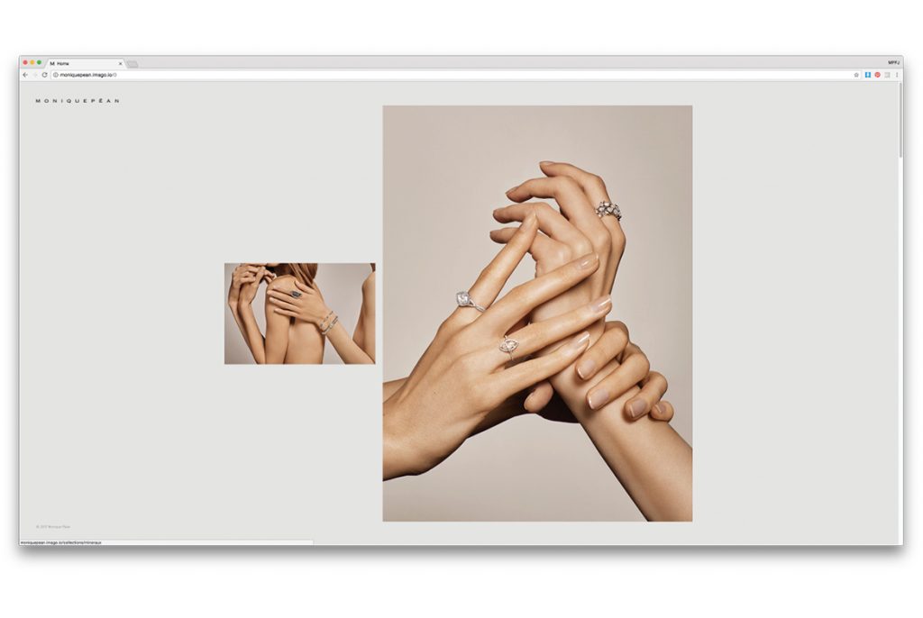
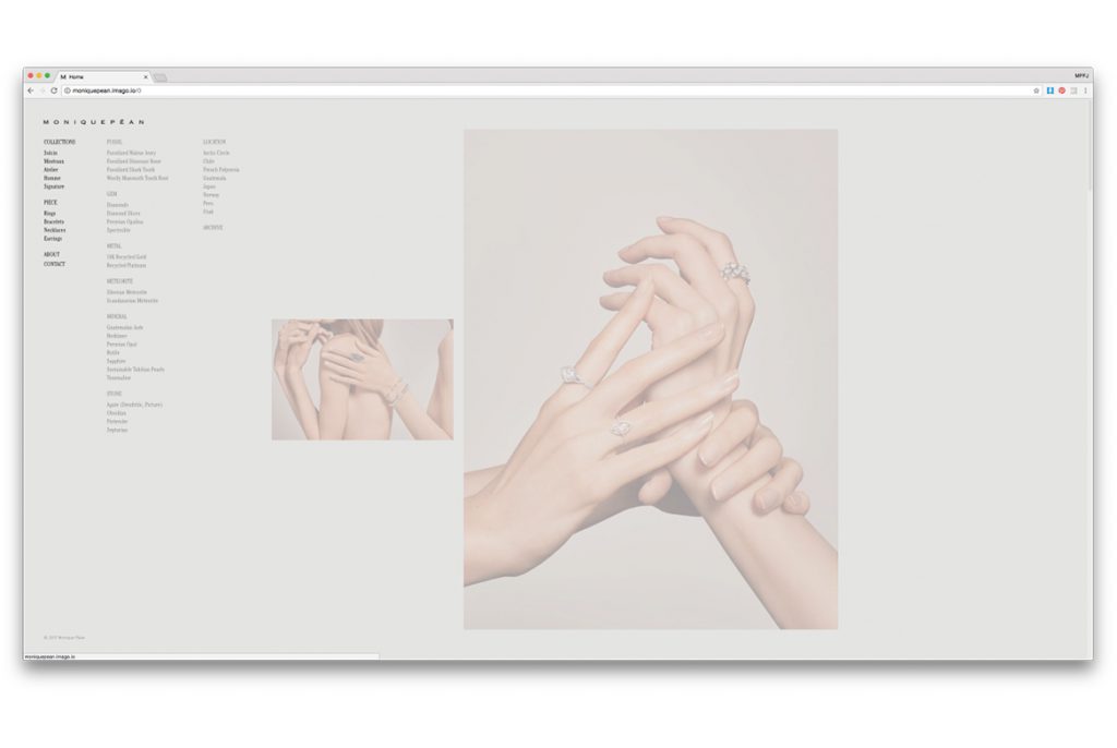
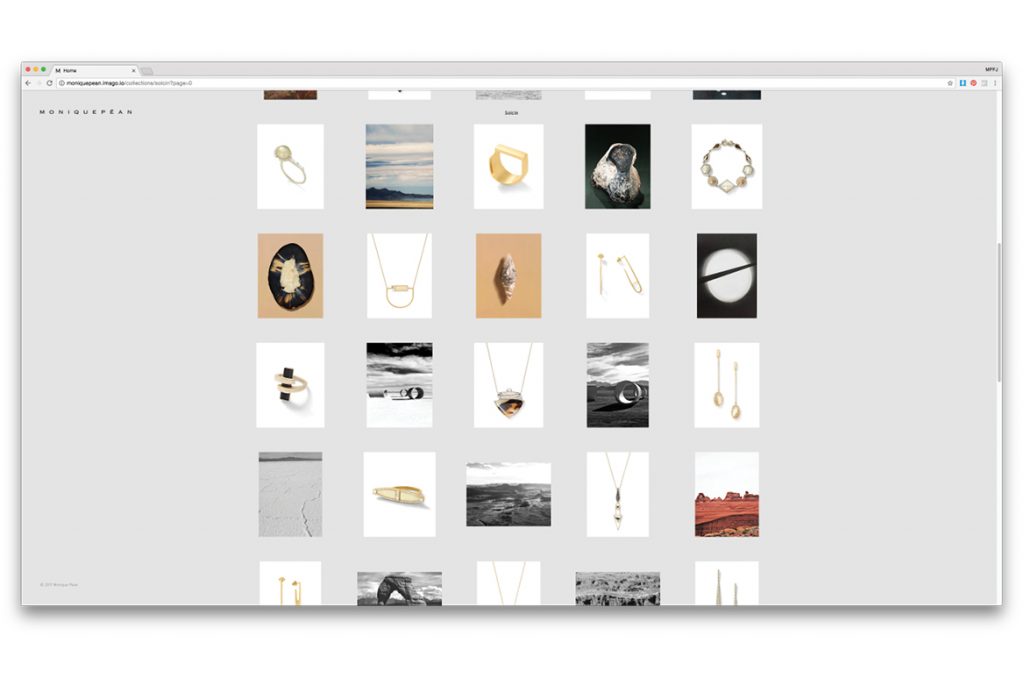
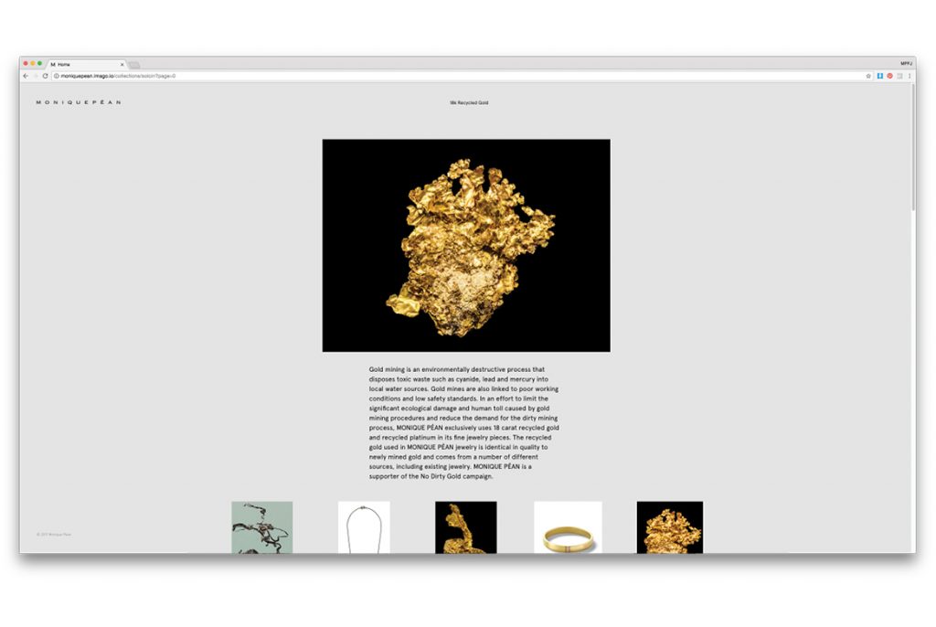
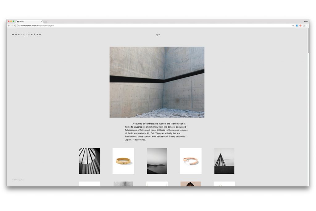
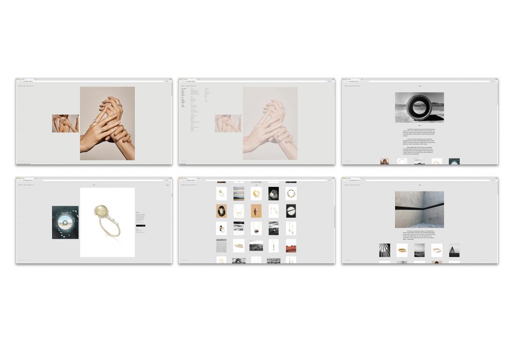
The final site is clean and minimal, using a light grey background to create strong contrast between the bright whites of the diamonds and the rich blacks in the fossils. Diptychs of travel and uncut specimens are presented with the jewelry styles throughout the browsing experience to educate and inspire the viewer to learn more about the different materials and designs. Every jewelry style has rich tags representing all the fossils, precious stones and metals that were used each piece and if clicked through take you to a corresponding information page, along with all other available styles containing that element. The main navigation is full yet simple with the first navigation tier showing familiar jewelry categories in case a user knows what they are looking for, the second and third tiers of the menu are also visible but faded into the background; showing the different materials and geographic locations the designs were inspired from creating a sense of adventure and spontaneity unlike most shopping experiences.
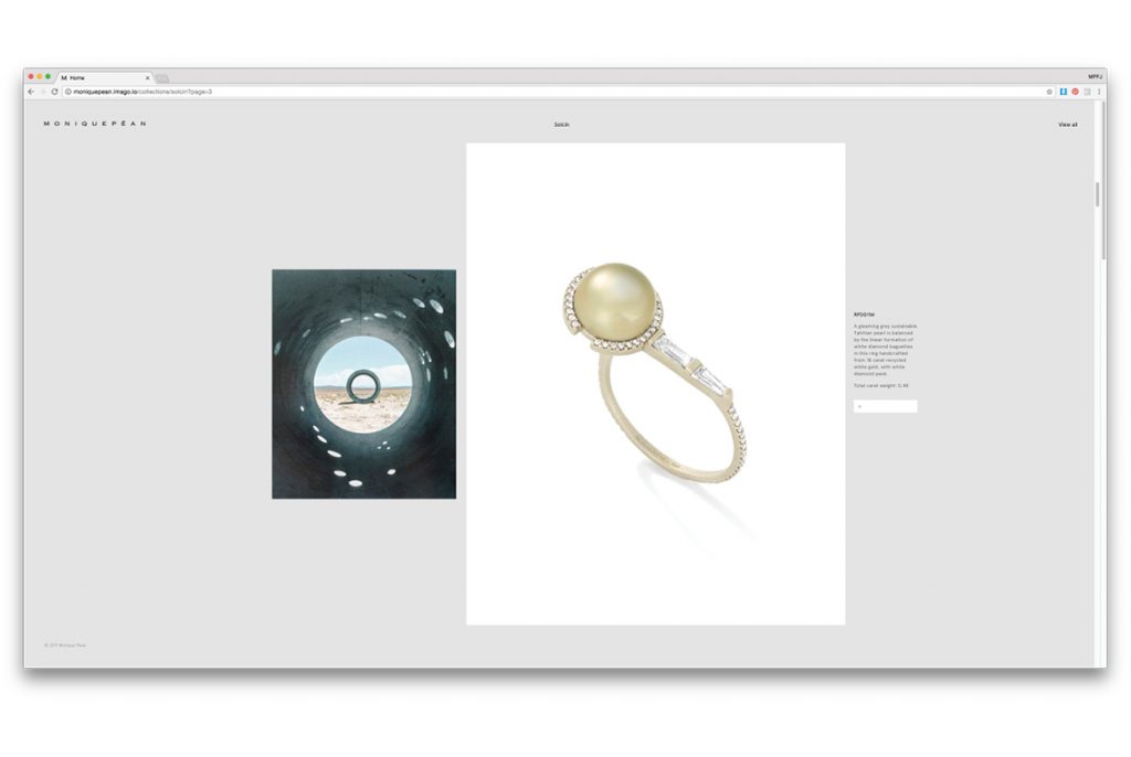
The individual product style pages are also thoughtfully designed with an airy clean gallery sensibility with nothing on the page except an image of the product and the corresponding diptych image to compare or contrast the jewelry style shown. A simple rollover the images will reveal the artist statement for the piece as well as the rich tags of the style materials and locations. The price still remains hidden to allow a exhibition-like experience to take over while reading the artist statement written for each piece, avoiding a traditional ecommerce feeling (a quick rollover on the box will reveal the cost). The final result is a shopping experience that allows you to get lost in the materials, travels and artfulness of the brand.